
In a world where design trends shift faster than ever, some logos remain instantly recognisable and relevant for decades. Think of Nike, Apple, Coca-Cola or Mercedes — their marks feel permanent, iconic and effortless. But timeless logos aren’t accidents. They are crafted with intention, built on design psychology and shaped by human perception. At Fusion Creative, we believe the strongest brands don’t chase trends — they outlive them. Here are the seven principles that give a logo true longevity.
1. Simplicity: The Core of Memorability
The human brain craves simplicity. We recognise and recall simple shapes far more easily than complex ones. A timeless logo removes unnecessary decoration and focuses on clear, essential forms. Simplicity ensures a logo scales beautifully, prints cleanly and works across every medium — from digital icons to vehicle graphics. The simpler the mark, the stronger the memory it creates.
2. Clarity of Concept
Behind every iconic logo is a single, strong idea. Whether it’s movement (Nike), hospitality (Airbnb) or precision (Audi’s rings), great logos communicate instantly. A logo should convey meaning without relying on explanation. If the concept isn’t obvious at first glance, the message becomes diluted. A timeless logo communicates effectively and instantly.
3. Versatility Across All Mediums
A great logo must perform everywhere it appears. Timeless logos hold their integrity in full colour, black and white, small sizes, large formats and on physical products. If a logo depends on gradients, intricate detail or effects, it risks becoming outdated or impractical as technologies change. Clean, flexible design creates longevity and ensures the logo works across all future platforms.
4. Distinctiveness: Standing Apart Without Shouting
Timeless logos are unique but not gimmicky. They avoid trend-based styling such as 3D effects, shadows or overly decorative elements that quickly date a brand. The goal is to stand out in the market while maintaining clarity and purpose. Distinctiveness ensures a brand is recognisable; originality gives it staying power.
5. Balanced Typography
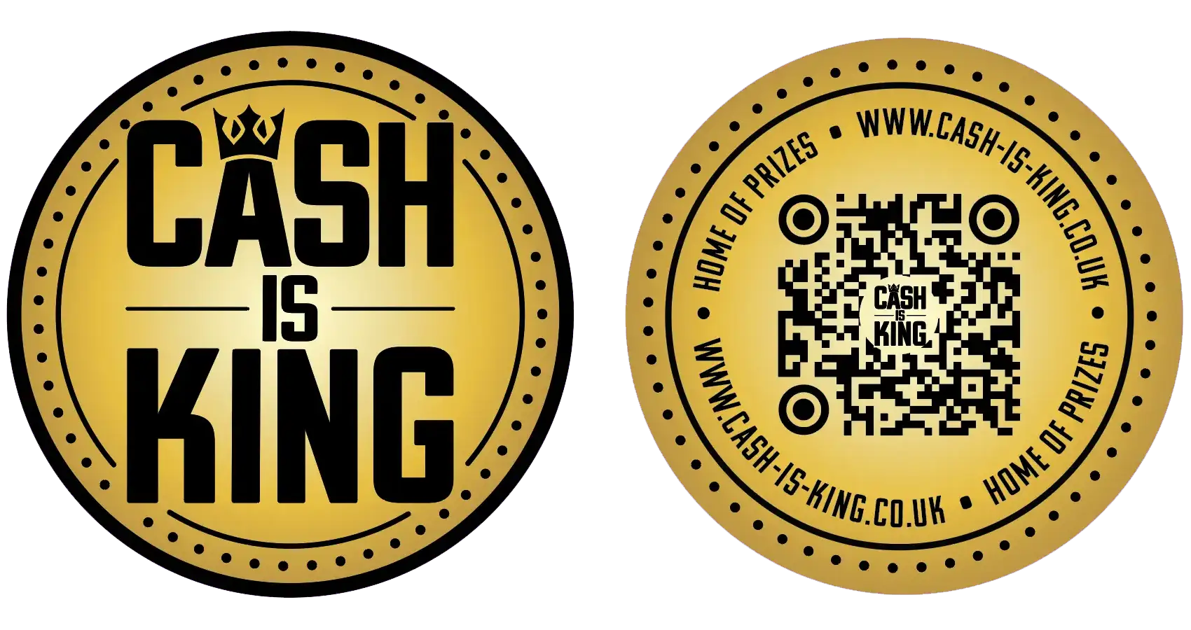
Typography shapes personality. Well-crafted typographic logos use lettering that is clean, legible and subtly customised to form a unique brand voice. Overly fashionable fonts date quickly, but well-proportioned, timeless typography creates a sense of trust and professionalism. Spacing, character modifications and consistent rhythm all contribute to a logo that endures.
6. Emotionally Resonant Design
Shapes and colours trigger emotional responses. Circles feel friendly and inclusive, triangles suggest direction and movement, and colours like blue represent trust while red communicates energy. Timeless logos tap into these psychological cues to form emotional connections. These subconscious associations help audiences build long-lasting relationships with a brand.
7. Consistency, Not Complacency
Even the most iconic logos evolve — but only subtly. Coca-Cola, Shell and Apple have all refined their marks while keeping their core forms intact. Consistency builds recognition; gentle evolution keeps a brand fresh. A timeless logo provides a strong foundation that can adapt without losing its identity.
A timeless logo isn’t just a design preference — it’s a business advantage. It builds recognition, strengthens trust, increases perceived value and avoids the cost of frequent rebrands. In a competitive world, timeless branding is a strategic investment in a company’s long-term future.
At Fusion Creative, we specialise in creating logos that last — strategic, distinctive and grounded in proven design psychology. Whether you’re starting a new brand or refreshing an existing one, we can help you build an identity with genuine staying power.