Your website is your best tool to captivate your target audience and provide them with material that encourages them to contact you. Unfortunately, by failing to make the right web design decisions for their websites, many companies are scaring away potential clients.
The brief list of design errors that are certain to frighten your visitors and lower engagement is provided below. Make sure you’re giving your visitors a nice, easy-to-use experience by giving your website a close inspection.
1) Poor usage of images
Images are crucial in this process since you only have 7 seconds to capture a user’s interest before they abandon your website. A guaranteed way to lose your audience’s attention is to use boring or pixelated visuals. This may involve using tacky stock photographs or text-heavy visuals that are taxing on the eyes.
As an alternative, adopt a classier strategy. Use plain forms and graphics to catch consumers’ attention and encourage them to explore the site further. Try different symbols and vector graphics to see which ones draw the user in without overwhelming them.
A well-designed and structured user experience must have images, yet poorly designed images might cause more harm than good.
2) Using ‘non mobile friendly’ pages
It is well worth the time and effort to ensure that your website is user-friendly for mobile consumers. It should be reasonably simple to ensure a robust and responsive mobile site because many contemporary Content Management Systems (like WordPress) take mobile responsiveness into account. It’s worth also noting that over 57% of website visitors use mobile phones or desktops.
3) Bad Typography
Text is the most powerful type of content, and websites are made up of it. No other form of material can compare to text’s ability to educate consumers, direct behaviour, and tell stories. This is why perfecting your website’s typography is crucial.
Choose a minimum of two or three typefaces for your website. After choosing your typefaces, give each font a header structure. For our page headers and body content at Fusion Creative, we use the Monsterrat typeface. Together, they produce a sense of coherence that is both distinctive and dynamic. In order to catch the user’s attention and make it simple for them to scan your site, try to select typefaces that are complementary.
4) Bring any dead links back to life
Strong internal linkage on your website will help both users and search engines. Pay close attention to your link-building strategy when optimising your site. Make sure your existing links aren’t leading users to broken or unpublished pages if your site hasn’t been updated recently.
5) Ensure easy website navigation
Too frequently, life companies will cram their primary navigation menu with dozens of different links and tools.
The fact is that users will quit your site if they can’t locate what they’re seeking for effortlessly. Users should be able to access any page on your website and locate what they’re looking for in three clicks thanks to the navigation structure you’ve chosen. This means that the navigation on your website should be simple and easy to use. Make those pages simple to access and appealing to the user’s preferences rather than removing pages or content that may be valuable. There should be a link to a relevant service when they are viewing a page.
At Fusion Creative, our background is graphic design and with this fused with our extensive digital knowledge, we create engaging websites that are not only easy to navigate and technically sound, but also well designed around your corporate identity.
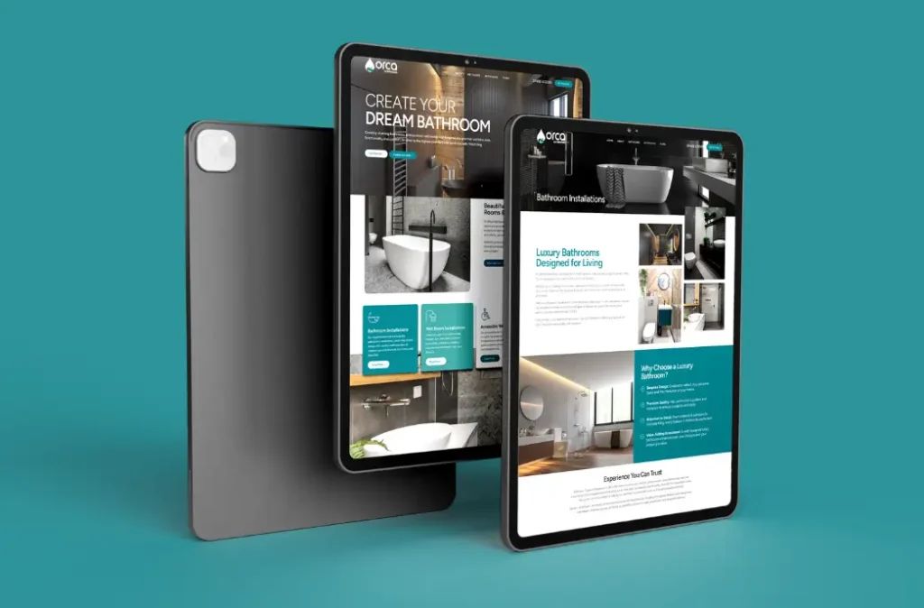
Take a look at our recent portfolio to see some of the graphic design and website design projects that we have created.
We recently redesigned a site for Severn Tree Management in Beweley including a new logo design, take a look at the transformation