
Yes, that’s correct — Google has had a subtle logo refresh of its iconic “G” logo with a soft-focus effect, giving it a more refined and modern look while maintaining its instantly recognizable four-color identity.
Key Points About the Logo Refresh:
Yes, that’s correct — Google has subtly refreshed its iconic “G” logo with a soft-focus effect, giving it a more refined and modern look while maintaining its instantly recognizable four-color identity.
Key Points About the Update:
- Softer Look: The new design introduces subtle gradients and slightly blurred edges, moving away from the previous flat, crisp version.
- Minimal Rollout: As of now, it’s visible primarily in the Google app on iOS and Android, and hasn’t yet been updated universally across all platforms.
- No Official Announcement: Google hasn’t issued a press release or blog post about the change, which suggests this is part of a gradual UI evolution rather than a full rebrand.
- Design Trend: This move aligns with current design trends that favor depth, texture, and realism over purely flat graphics — possibly inspired by the shift to more tactile and accessible UI visuals in both Android’s Material You and Apple’s design language.
The update to Google’s “G” icon is subtle but symbolically significant in the evolution of its visual identity.
What’s Changed:
- From Blocks to Blends:
The original “G” logo (2015) used distinct, solid segments of Google’s four signature colors — red, yellow, green, and blue.
The 2024 refresh introduces gradient transitions between these colors, creating a more cohesive and fluid design. - First Major Refresh Since 2015:
This is the first redesign of the circular “G” since it replaced the older, all-blue lowercase “g” that dated back to Google’s pre-Product Sans era. The 2015 logo refresh introduced:- The Product Sans wordmark
- A flat, geometric look
- An emphasis on mobile-friendly, scalable design
- Why It Matters:
While the change might seem cosmetic, it reflects broader design trends in tech:- Humanising digital interfaces with softer visuals
- Improved readability and visual harmony across light/dark modes and high-resolution displays
- A desire to modernize without disrupting recognition
Aesthetic & Strategic Implications:
Google’s decision to roll this out quietly suggests it’s treating this as an iterative design evolution, rather than a rebranding moment. That’s consistent with their recent UI strategy — adaptive, inclusive, and subtly dynamic, as seen in Material You and other interface refreshes.
Would you like me to mock up a visual comparison of the old vs. new G icon, or write a short article or social post explaining the change to an audience?
So far, Google has remained tight-lipped about the reasoning behind the redesign or whether the new ombre style will extend to its wordmark or other products like Chrome and Maps.
However, the updated logo has already drawn comparisons to the gradient emblem of Google’s AI assistant, Gemini, introduced in 2024 and designed by San Francisco-based studio Strohl. At the time, Strohl described the dynamic gradient as a reflection of the AI’s “ever-evolving nature,” symbolizing its capacity for continuous growth and adaptability.In recent years, Google has rapidly expanded its AI capabilities in response to the surge in popularity of chatbots like OpenAI’s ChatGPT.
However, the rise of energy-intensive AI technologies has come at a cost. In 2023, Google reported a 50% increase in carbon emissions, driven largely by the astronomical energy demands of powering and training large-scale AI models.
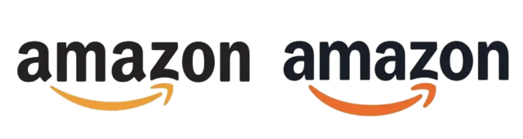
Google isn’t alone in evolving its brand identity amid this shift. Other tech giants are following suit — Amazon, for example, recently had a logo refresh, adding a “more empathetic smile” beneath its iconic wordmark in an effort to soften its visual presence.